
MID CENTURYHILL HOUSE
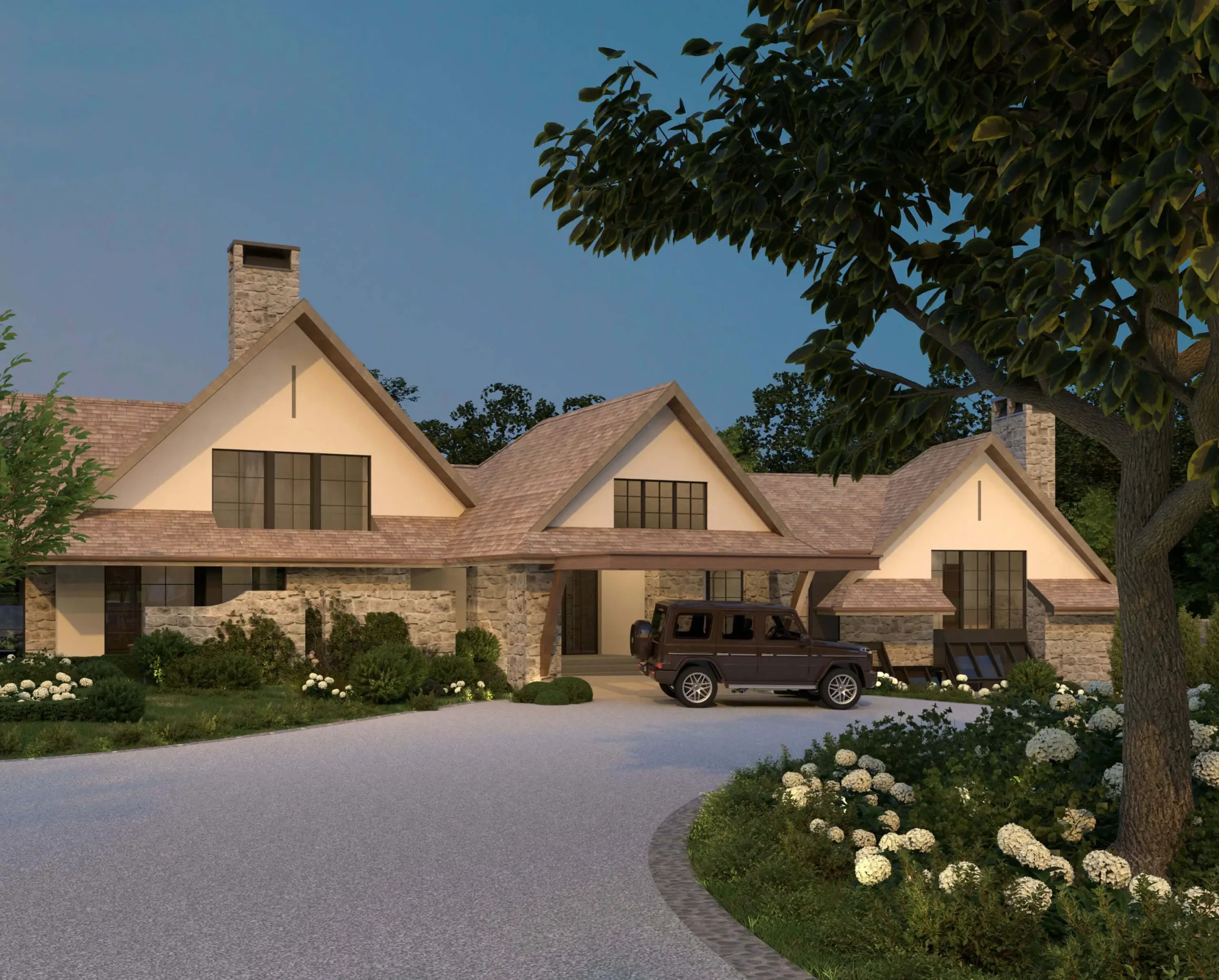
The Mid-Century Hill House is a body of work that is both understatedly stylish and highly cognizant of its surroundings, a factor that shaped the body of work for principal designer Jesse Sahlani. He captured proportions that feel out of the ordinary in the best way possible, and while the character of the home is quiet and its massing is seemingly nestled into the grade as a function of its low, wide proportions, it certainly does not lack style. The width, proportions of the gables and roofs, and front courtyard embody the ethos of a luxury wellness resort in both stylistic direction and composition. The result is an environment that feels connected to the nature that surrounds it, creating an environment that feels intentional and rejuvenating.
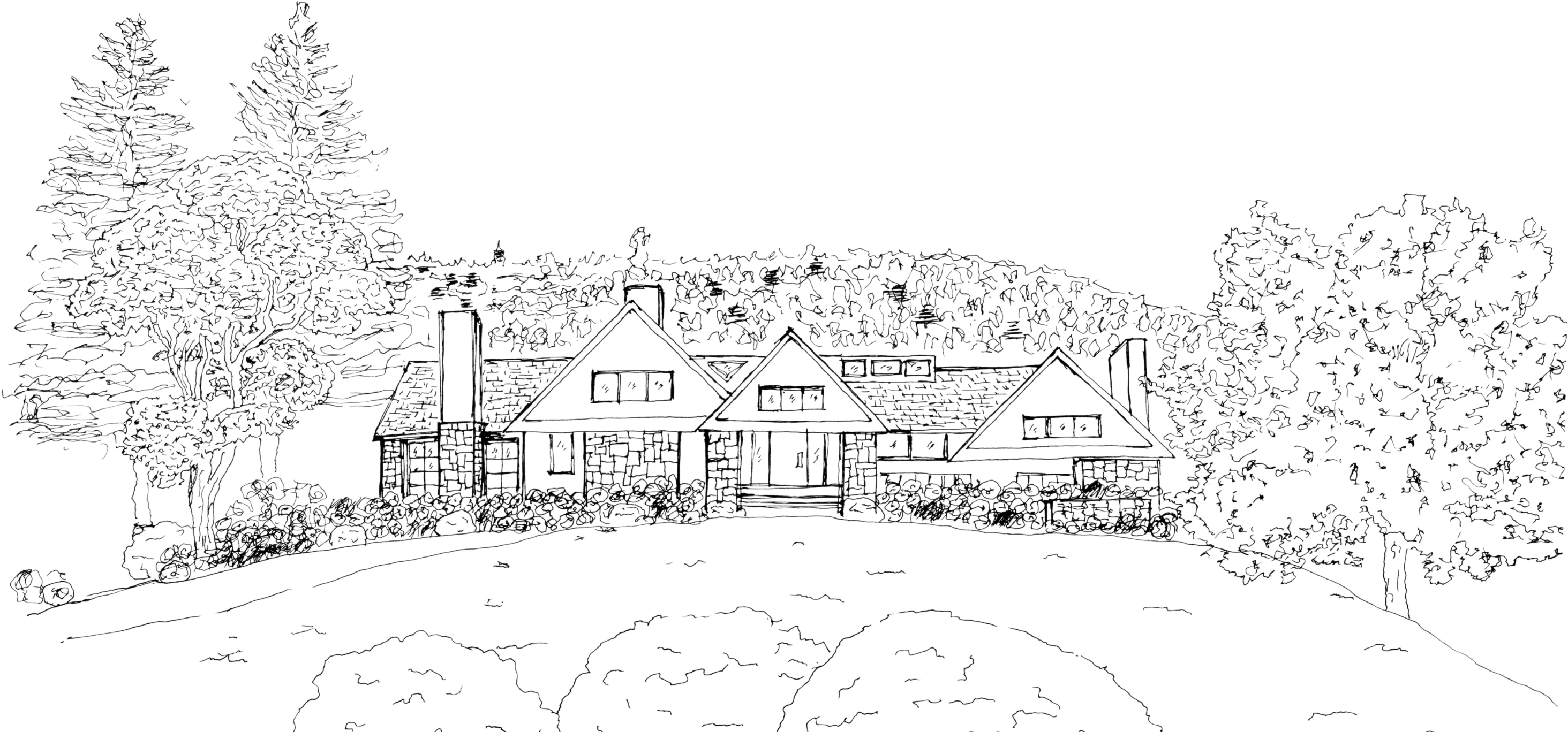
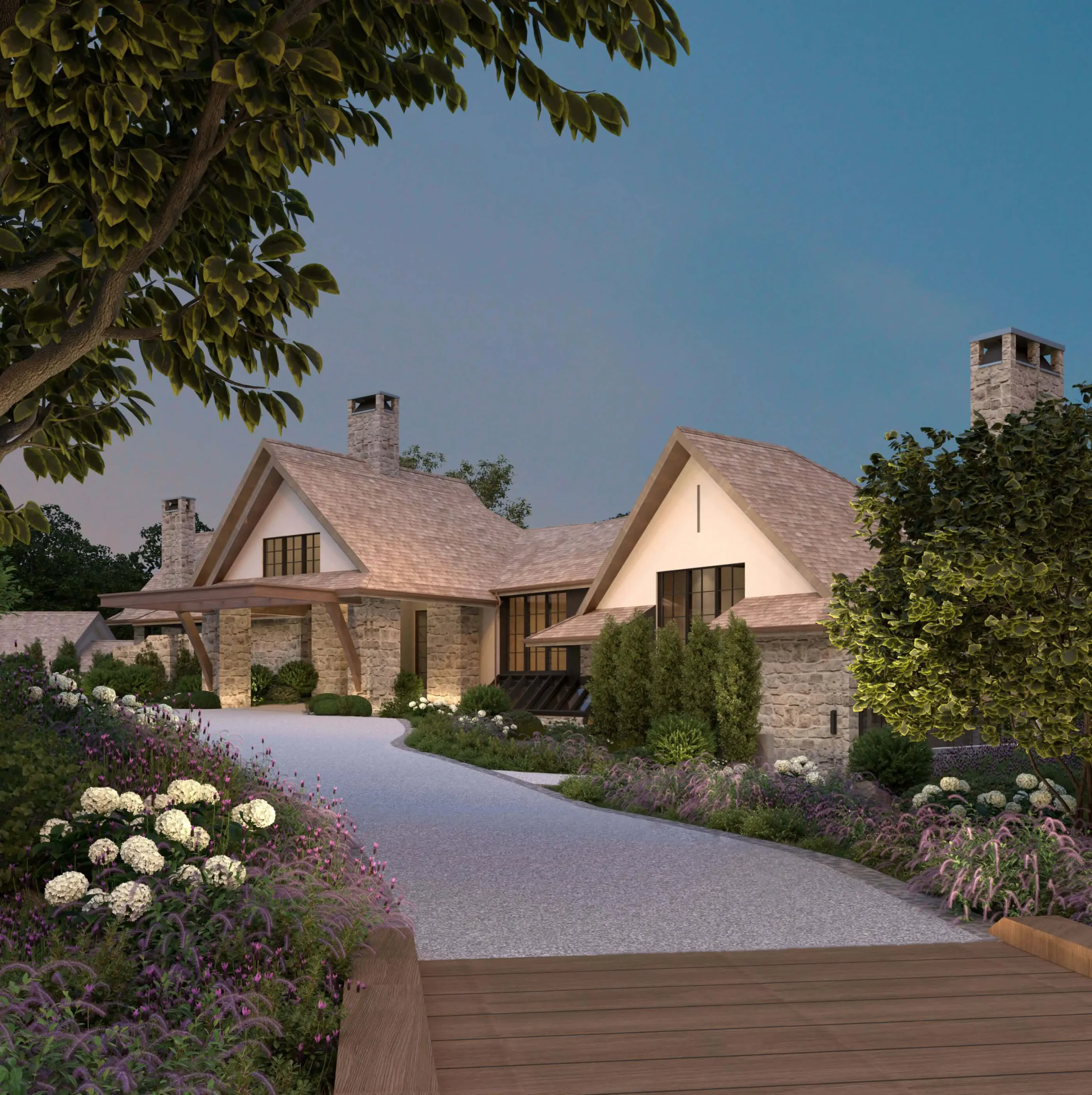
The roof massing Jesse designed was actually meant to be appreciated from both left and right angles, upon approach from the driveway and when coming back from the lake. To frame these views perfectly, he curated the exact curve and path of the driveways throughout the grounds, as each was designed to offer views of the home, or to draw your eye to the surrounding natural features. It is little details like this that contribute to the character experienced throughout the compound. The front courtyard of the main home is an excellent example of this, creating a space that is inviting for guests, surrounded by the lush greenery of the diverse gardens.
The sketch of the site plan below offers clearer context for Jesse’s master plan for both the driveways, gardens, and the positions of outdoor amenities. By approaching the planning for the lot as a whole, he sought to create a sense of connection between the main structure, the pond and the pond house, as well as the guest structures. Similar to a resort, his garden and ambient lighting locations are positioned to visually shorten the walk between different structures and areas within the grounds.
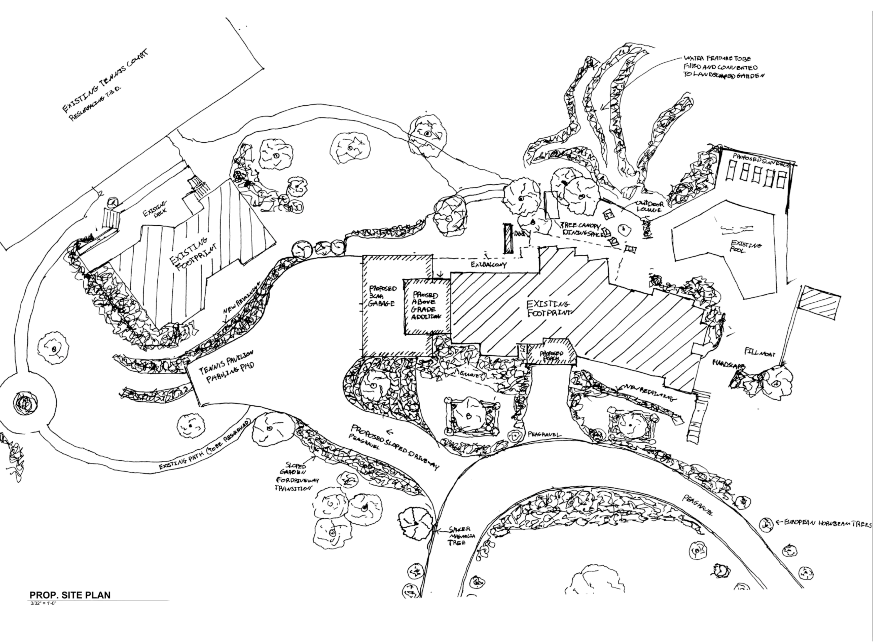
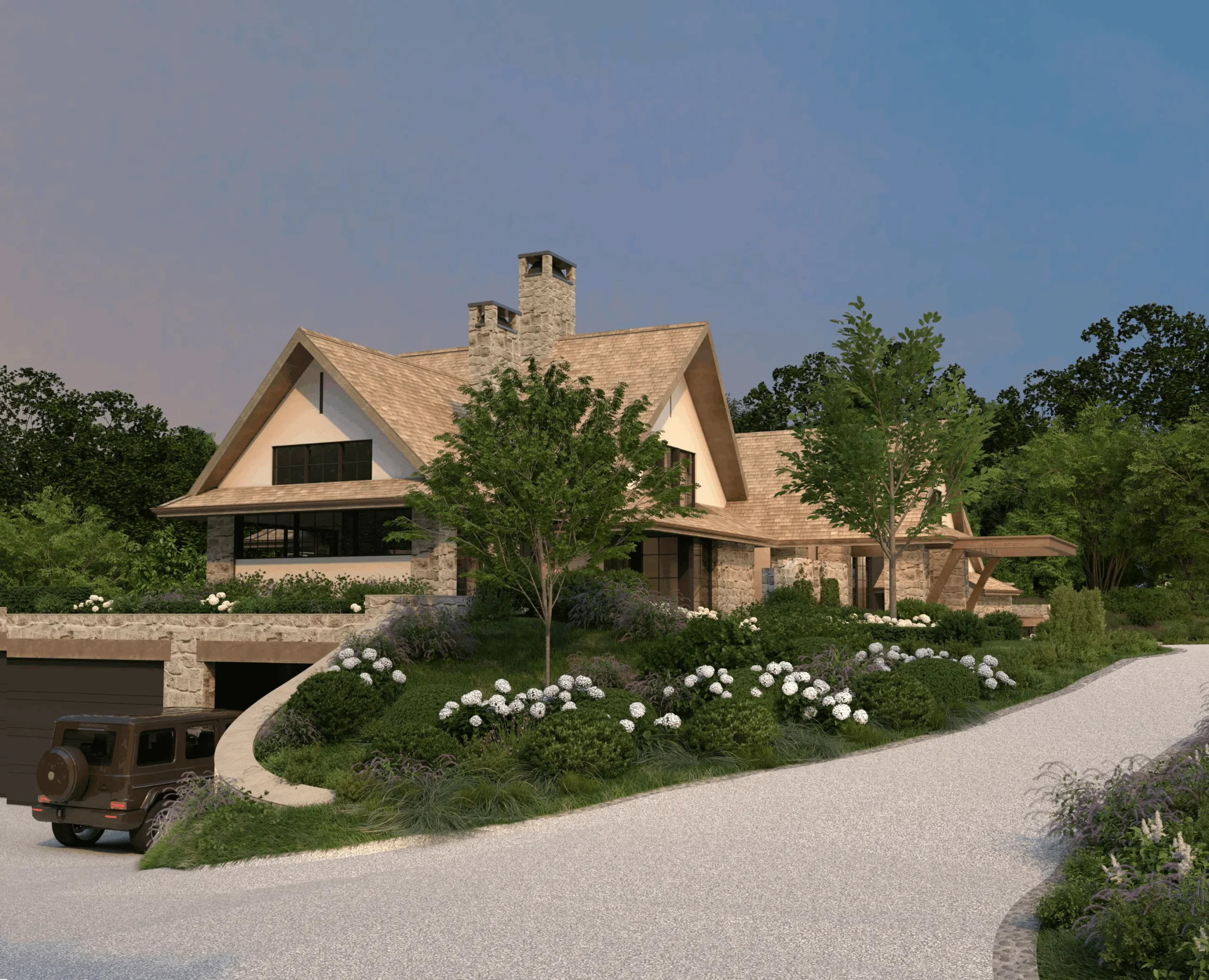
Another great visual breaking down how Jesse worked with the natural topography of the property is the garage location. The entrances of the structure are positioned on the side of the home where the grade falls. By doing so, he avoids unsightly garage doors being included in a viewers first impression of the facade.
However, in his usual fashion, this was no unsightly side of the home, as he designed a gable wall overlooking this space, bringing natural light into the main floor plan, and feeling uniform with other portions of the facade, as from the pond, this grade depression isn’t visual. This an example of his commitment to architecturally cohesive surroundings throughout the grounds.